Role
User Research
Product Strategy
UI Design
Brand Identity
UX Design
Tools
Figma
Miro
Slack
Notion
Timeline
3 months
My Role
I joined the Frenalytics team in March as a UX/UI Design Intern where I worked with the Lead Designer to explore design decisions for Lionic. With over 12 years of experience in healthcare, I had used various EHR systems and was able to use my previous experience to help design a new EHR using recycled components that Frenalytics used for their learning software but create new components to ensure the best overall user experience for healthcare workers.
Business Goals
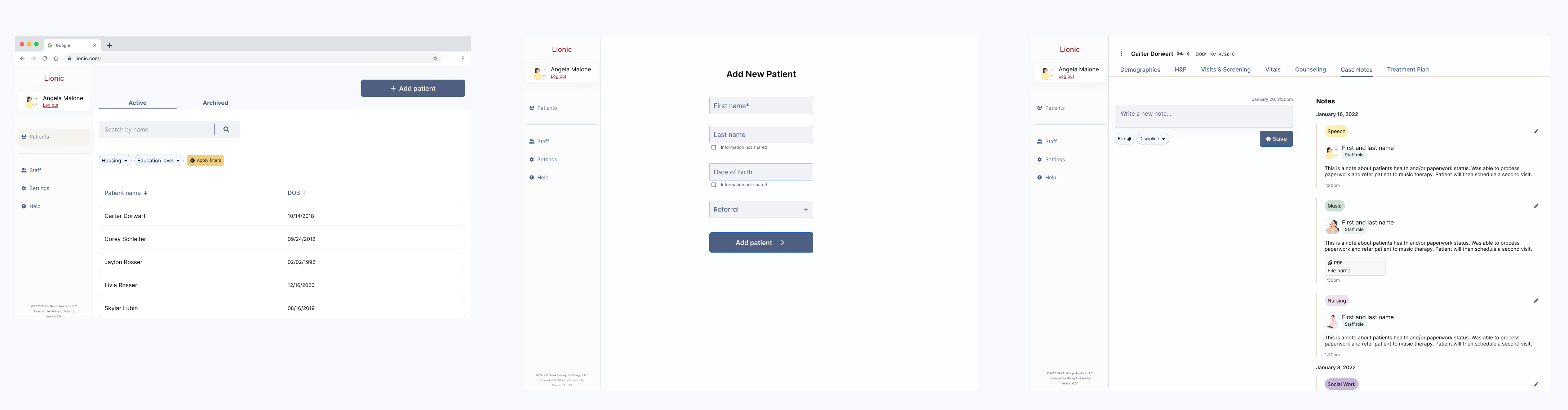
The goal for Lionic was to work on the first release of the product with basic functions such as being able to add a new patient, a patient list, demographic, H&P, screenings, and case notes. Within the Lionic EHR system, there will be 7 disciplines where staff will be assigned.
Brand Identity
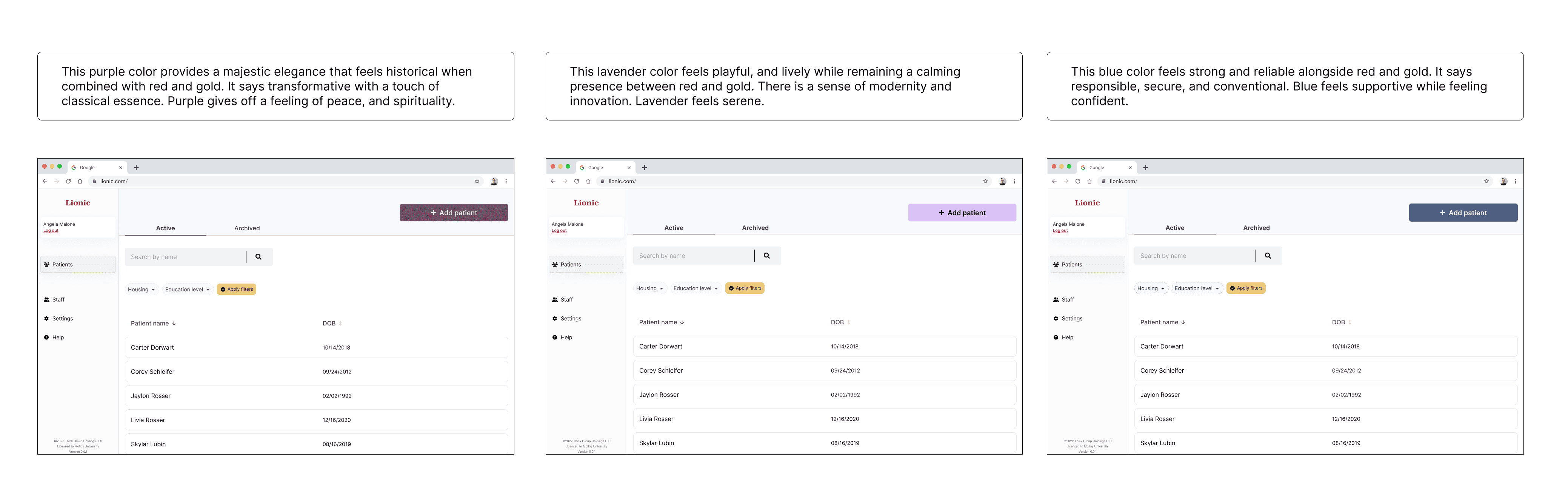
The first step was to explore the brand's identity by selecting top 3 colors to present to the CEO and the Lead Designer. I researched various color schemes of competitors while looking at color palettes inspired by Molloy University's mission. After an in-depth explorations of tones, and hues, we landed on the top 3 options being deep purple, lavender, and steel blue.
Typography
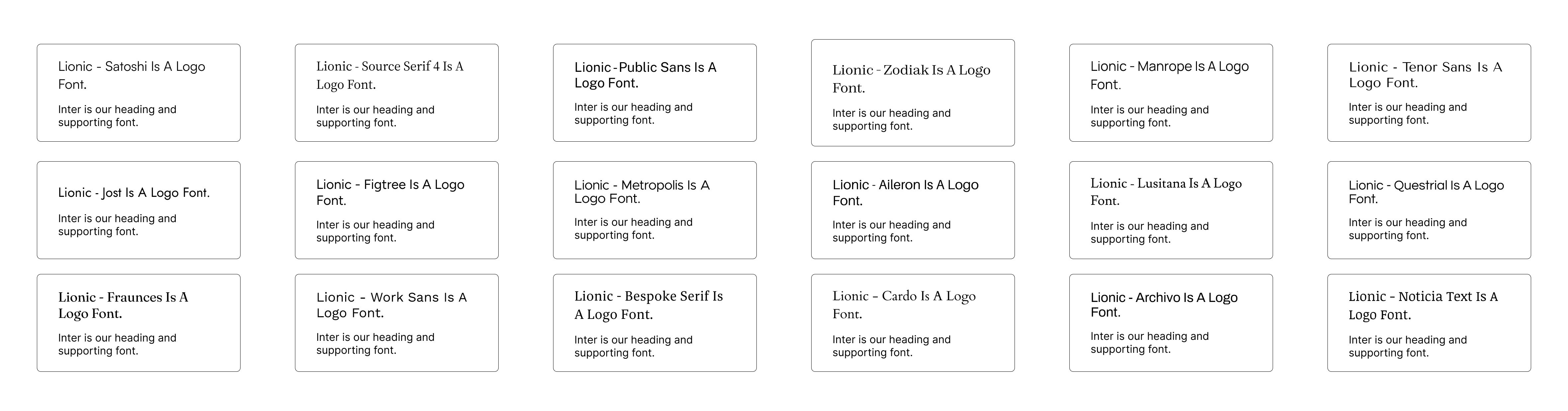
Alongside the brand colors, we needed to choose a font to represent the Lionic logo and one font to be used as the primary font for the rest of the EHR system. The Lead Designer and I were able to narrow down it down to 3 different pairings. The CEO approved Inter as the heading and supporting font but wanted to see more options for the Lionic logo.
In the end, we looked at 18 pairings and decided that Public Sans would act as the logo font. After the text fonts were chosen, we started to look at mono font options for numbers. I narrowed it down to 4 options by looking at how the numbers in mono font looked side by side with Inter, the primary font, and decided that Roboto Mono would be used when using numbers.
Discipline Exploration
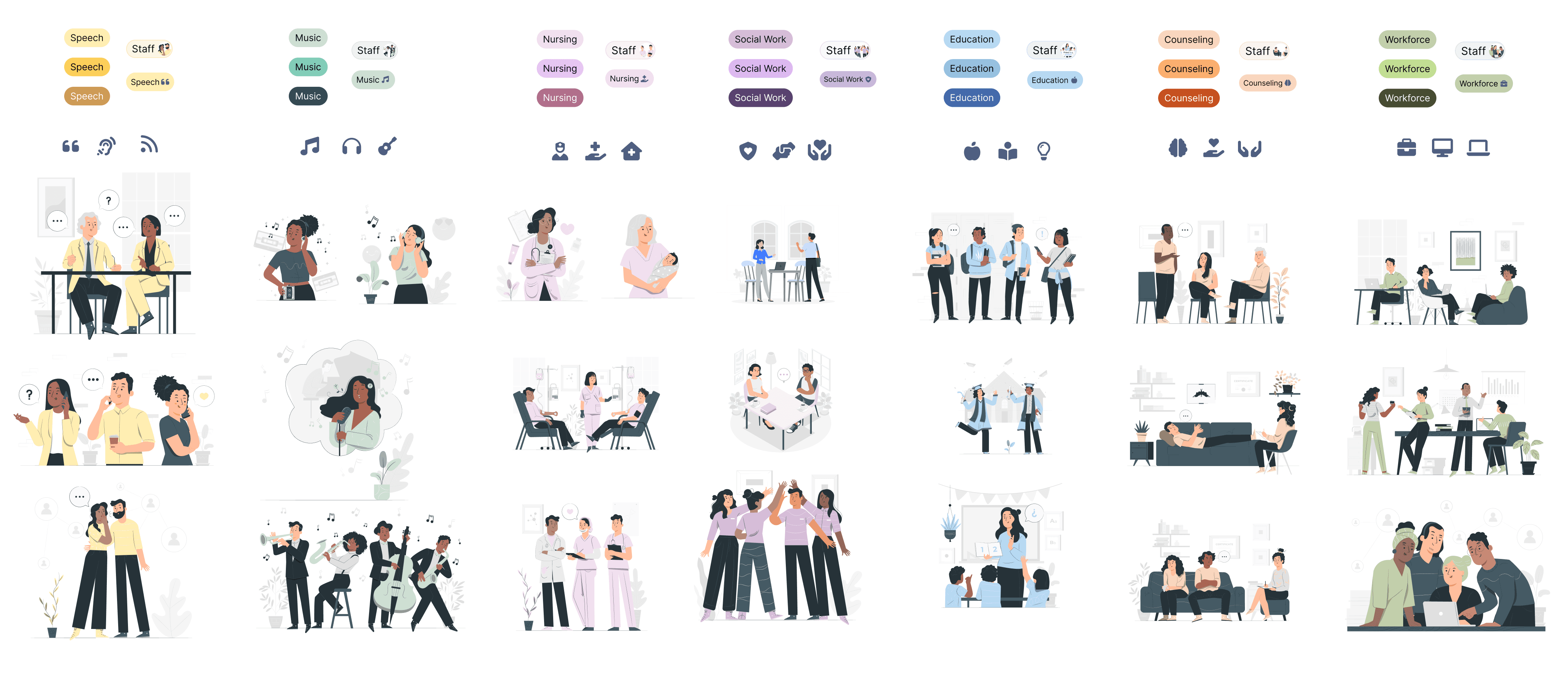
There are 7 disciplines within Molloy University's community care mobile clinic; Speech, Music, Nursing, Social Work, Education, Workforce, and Counseling. Keeping this in mind, and the possibility of expanding this onto other healthcare companies, we had to explore 7 colors, illustrations, and icons to represent each discipline.
Illustrations, Icons, and Colors
There were over 40 illustrations we debated over, and top 3 options of icons for each discipline. The use of illustrations was not only to visually represent each discipline but to add something different that no other EHR system was doing — to bring a fresh young twist to healthcare. The biggest reason we took this into consideration was the user; students who would be given limited access to the system. The illustrations are mainly used in chips, a minimal visual that didn't overpower the functionality of the product.
When exploring color options, with the user in mind, students and professionals, there was an overwhelming amount of options but we narrowed it down to a yellow, teal, pink, purple, blue, orange, and green. Within that color range, we played with lights and darks, and various hues and tones. There was a unanimous vote on the lighter color choice that felt bright but safe.
Exploring Common Components
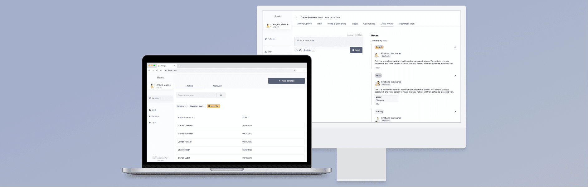
I was then tasked to look at the Frenalytics design system and produce a UI kit with basic components in Figma that could be recycled and used in Lionic. I worked on the layout of the case notes screen, modifying some of the components and adding the discipline chips to identify the author of the note.
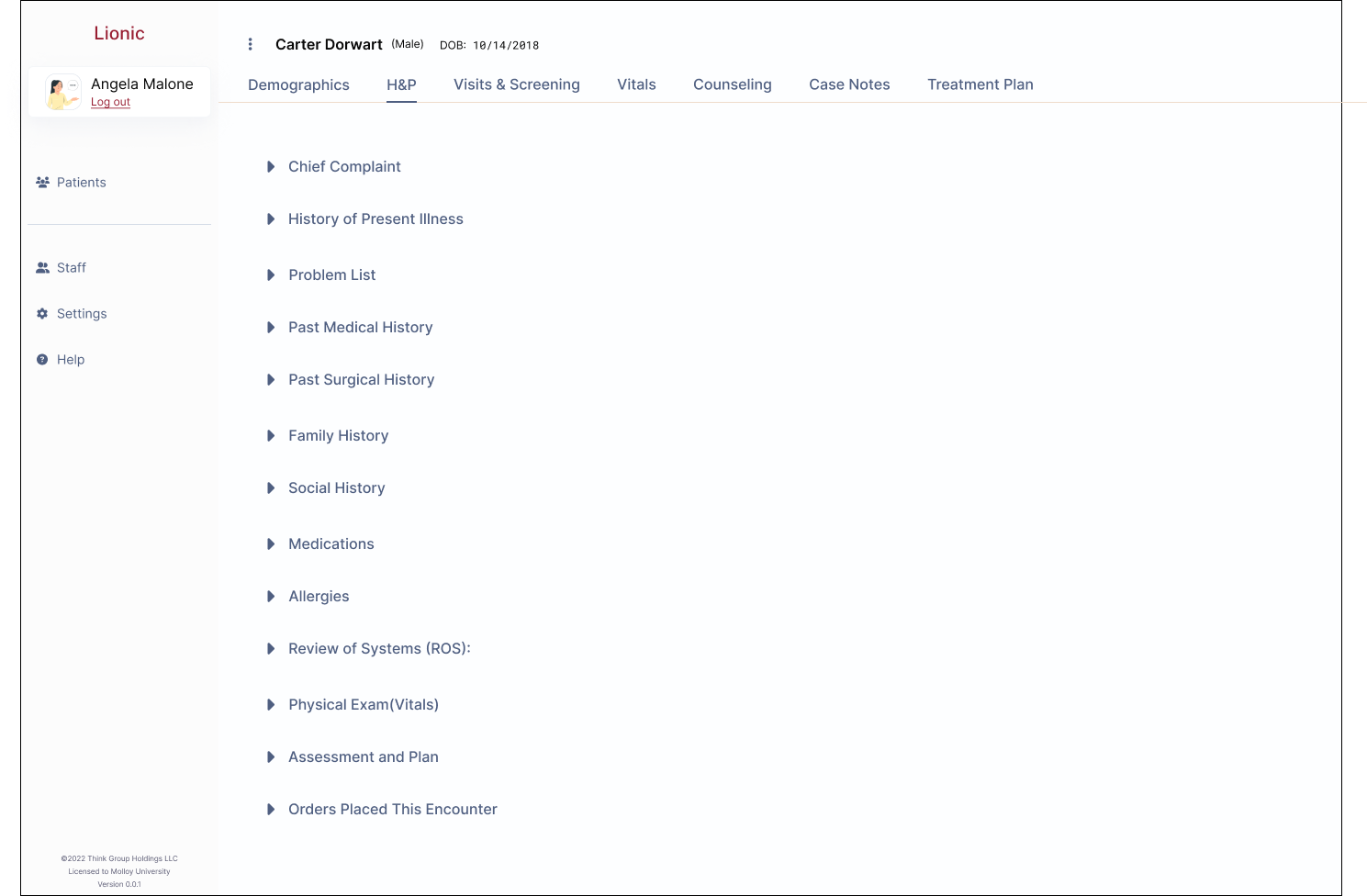
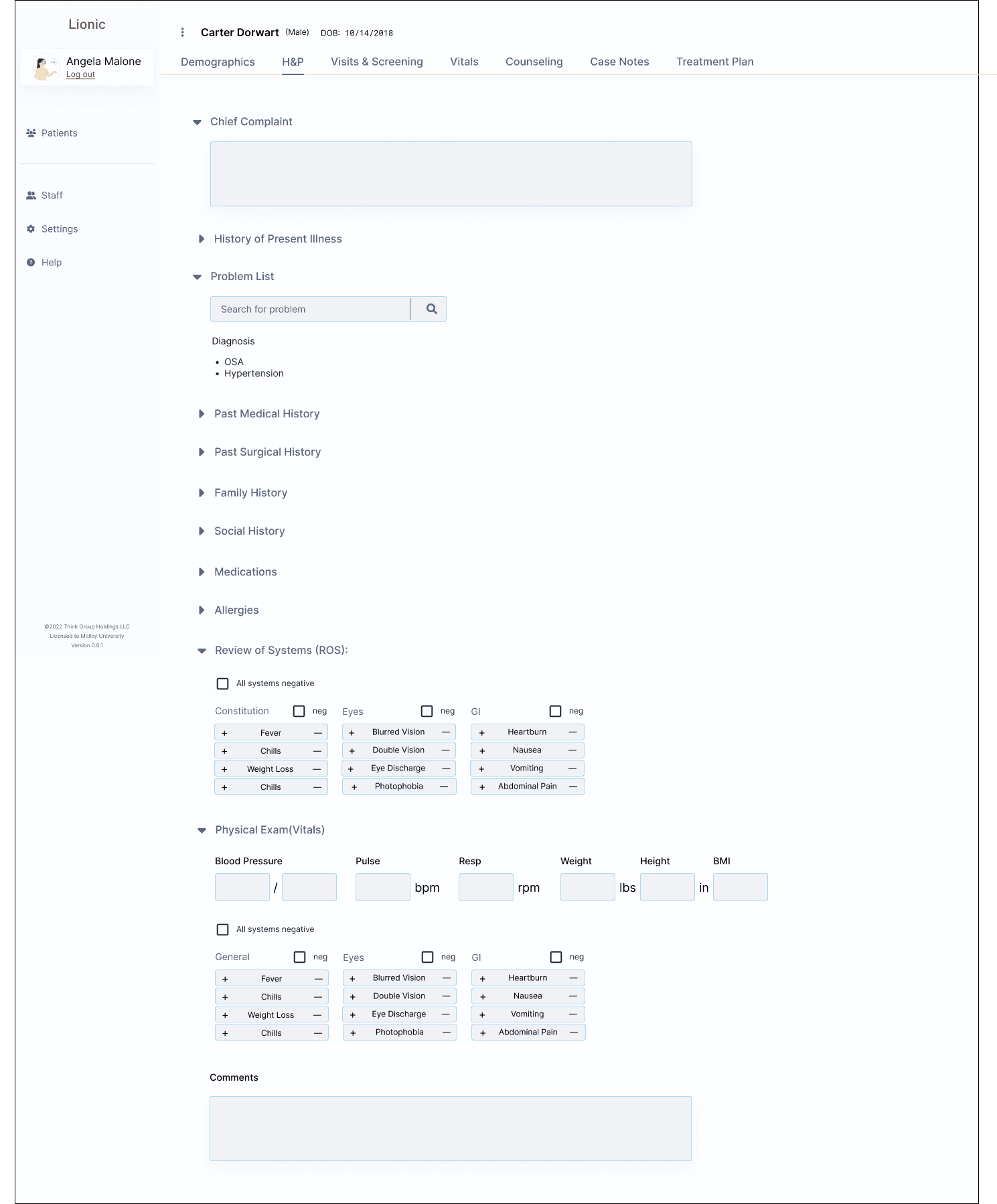
Researching H&P Checklists
In order to build the History and Physical (H&P) screen, we did research on most common checklists a physician will examen during a visit. We also asked Molloy University for their input on areas they use in their community care program.
We needed to be sure they could use this list to input their free heart health screenings (including blood pressure, blood sugar, cholesterol), hearing screenings, speech screenings, mental wellbeing support, music therapy, and community referrals.
Researching User-Friendly EHR Functions
Each required element of an H&P needed a functional and user-friendly method in order to be filled out. I thought about the 12 years of experience using EHR systems such as Epic and Act, company personalized EHR systems I had used and the many people I trained from ages 16-70 years old, and gathered insights based on observations and experience.
Lionic needs basic, user-friendly functions where it would be quick, easy, and efficient to teach someone how to use. Unlike Epic that requires its users to take different trainings depending on the users needed level of access, and to pass a test for each training in order to be given access.
The basic functions came to be comment/notes feature, checkboxes, input boxes, quick search features for ICD-9 or ICD-10 codes, and add/subtract feature for most common problems such as fever, heartburn, and weight loss.
High Fidelity Prototype
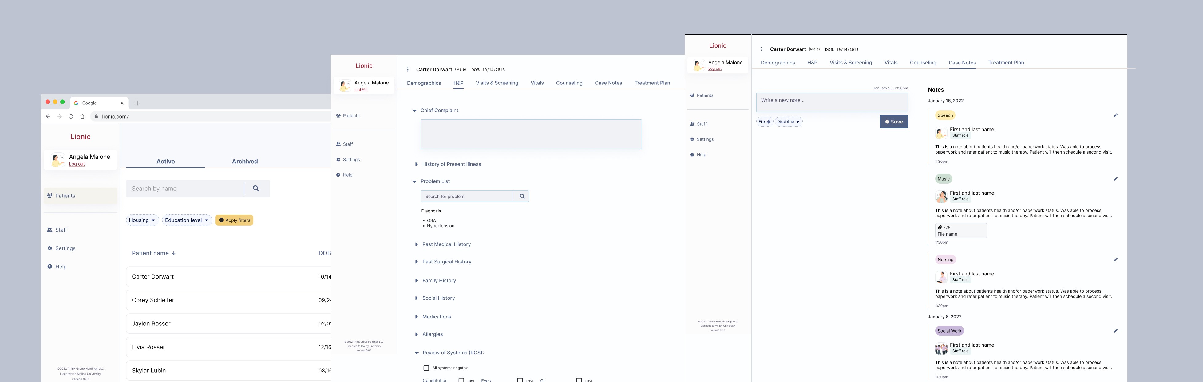
I have put together a prototype that takes us through the screens I had the opportunity to work on. This takes us through the sign in process to the patient list where we click on the "Add patient" button and input the patient information. Once we add the patient, we are taken to the patient profile where we can start to fill in the H&P and look at the case notes.
Three key achievements:
Brand Identity— being able to start a project from beginning to almost the end, I was able to establish a brand identity foundation for Lionic
2. Established a design kit— between recycling components and designing new layouts, I helped set a design kit that will make future iterations an efficient process
3. Presenting to stakeholders— I was able to present my findings weekly and monthly to Frenalytics CEO and Lead Designer, whether it be research or design decisions
Next steps…
In future launches, I believe working on the navigation menus could serve the product well since multiple navigation menus are common in EHR systems. The ability to open more than one tab and pin tabs are also beneficial functions.
Each navigation menu has a purpose that breaks down the chart/system in order for the user to have easier, functional, and quick access to patient care.
I am excited to see the shipped product and how future iterations will change over time as Lionic grows and the healthcare field evolves.